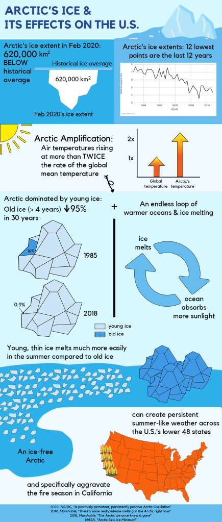
In the infographic, seven data points are divided into three sections.
The first set, consisting of the two uppermost data points, helps paint a broad picture of the topic. After reading the title, I want the first piece of information readers get from the infographic to be the latest update of Arctic’s ice extent, specifically in February 2020, as it is necessary for them to be informed of the most up-to-date statistics. The second point being illustrated is a summary of the scope of the situation and there is no better way than a graph visualizing yearly ice extents to display a worrisome trend.
Next, the following four points are grouped into one middle section, with them all being related to the phenomenon known as ‘ Arctic Amplification’. Occupying more than half of the infographic, it plays a major part in the melting of ice in the Arctic. I made the arrows in the graph visualizing ‘Arctic Amplification’ a gradience of orange and yellow not only because they represent heightening temperatures but also to connect with the vibrant orange-colored U.S. map at the bottom, and how the colors create a sense of urgency for changes which we are in desperate need of. Underneath the explanation of ‘Arctic Amplification’ as the umbrella issue, three implications of the phenomenon are depicted, including the alarming reduction of old ice, its consequence, and a vicious cycle of warm oceans and ice melting. As a result of ‘Arctic Amplification’, the domination of young, thin ice is incredibly dangerous. Rick Thoman, a climate specialist at the Alaska Center for Climate Assessment and Policy, emphasized that
“The loss of the multiyear ice is really a big driver here,”
and that
“First-year ice is much more susceptible to the vagaries of weather,”
thus making the already vulnerable Arctic even more vulnerable. I visualized the melting of young ice to flow directly down to an ice-free Arctic to stress how the melting of ice caused by everything stated above will have a direct impact on the U.S., which is also the final data point.
With low and continuously decreasing ice extents in combination with the phenomenon of ‘Arctic Amplification’ and its implications, a soon-to-be ice-free Arctic is and will continue to have destabilizing effects on climate patterns around the Northern Hemisphere and especially the U.S. In particular, a warm Arctic reduces the temperature difference between the U.S.’s middle-latitudes where the lower 48 states lie and the Arctic. This will unfortunately dampen the winds and allow the jet stream to bend in big waves. There is much evidence that this phenomenon will result in persistent summer-like weather patterns across the U.S, Europe, and more. Additionally, this weaker jet stream is already creating an extendedly damaging fire season as it is pushed up higher into California.
All in all, it can be seen that the melting of ice in the Arctic will have a tremendous influence on several nations and their people, the U.S. in particular. Hopefully, my infographic will help more people grasp the severity of the problem we are currently facing regarding Arctic’s ice specifically and global warming generally, and thus prompt more actions to be taken in the foreseeable future.
